TWO SUBTLE DIFFERENCES SHOWN BELOW
* * * * * OPTION #1 (WITH SAND DOLLAR) * * * * *
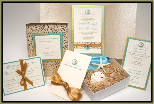
The main colors of this set
are ivory, gold shimmer, aqua shimmer, and other natural neutral colors. Focusing on these colors, plus a decorative golden vine pattern and very elegant script throughout, I have created a wedding invitation set that is quite unique and beautiful for a beach wedding.

The
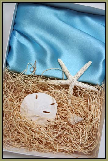
set is mailed in a white glossy invitation box and the
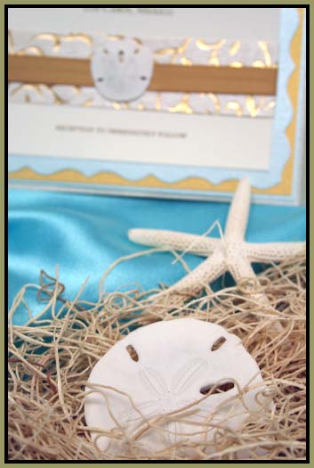
contents are nestled in packaging that has been decorated to resemble the beautiful turquoise waters and the sandy beaches of Mexico. Various sea embellishments have been tucked into the sand-colored excelsior and overlayed on the turquoise satin material This is an extremely unique and beautiful way to present the wedding invitation set to the guests.
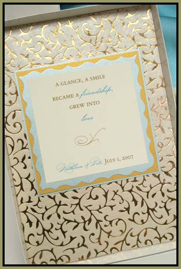
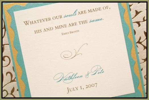
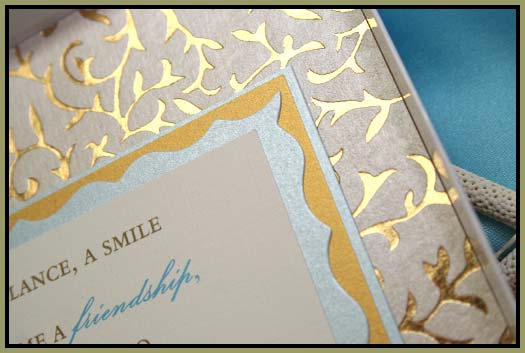
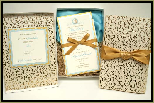
The lid of the box is lined with a layer of ivory and gold vine paper, with an introductory quote layered in the center. This custom design introduces the set's colors beautifully and sets the tone of elegance. The pattern is a smooth gold, which reflects light every time it is shifted slightly (see the upper right corner).

The layered quote is layers of ivory linen, aqua shimmer, gold shimmer and another layer of aqua. This complements the ivory and gold pattern behind it; the tiara-cut edge of the 2nd layer adds to the elegance of the set. The quote introduces the invitation, as well as the bride and groom.
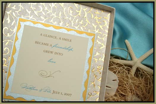
Another view of how each individual layer reflects light in its own way.
It even bounces off the inside of the glossy white box lid.
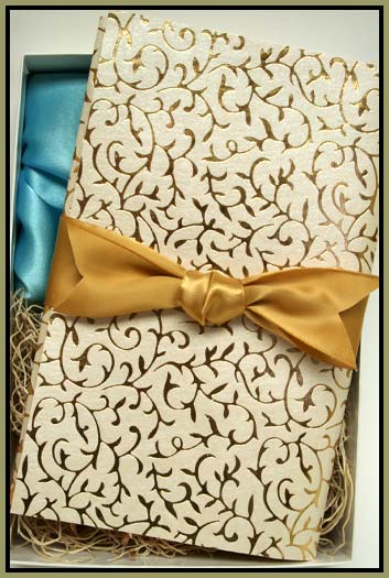
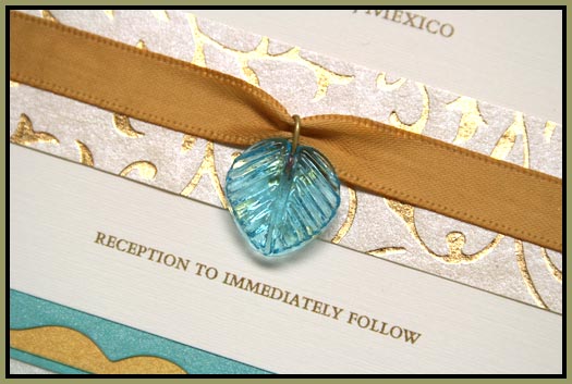
The invitation is wrapped with the matching patterned paper; a wide gold satin ribbon wraps this. The ends of the ribbons have been given a decorative v-cut.
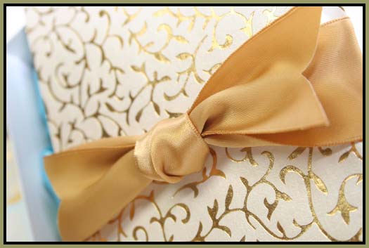
The golds of both paper and ribbon complement each other beautifully.
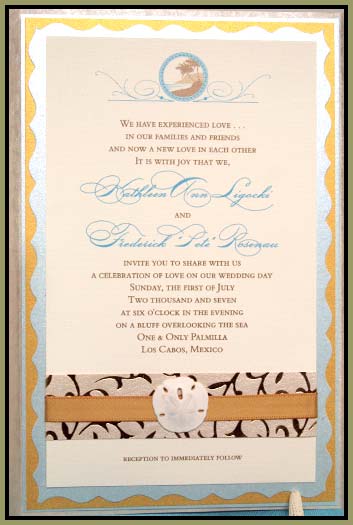
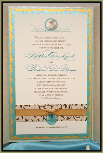
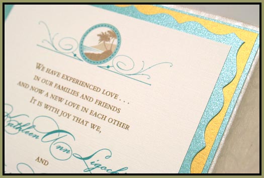
When the ribbon is slid off the invitation (not permanently attached so that the guests can keep it in perfect presentation), the paper wrap is opened to reveal the invitation inside! The invitation has been given four layers: ivory linen, aqua shimmer, gold shimmer, and another layer of aqua. At the top of the invitation, an embellished beach element has been designed and printed in aqua and light brown and placed in the center. The invitation's main wording is in the center in matching colors. A matching patterned paper, gold satin ribbon wrap, and fuschia flower finishes off the bottom.
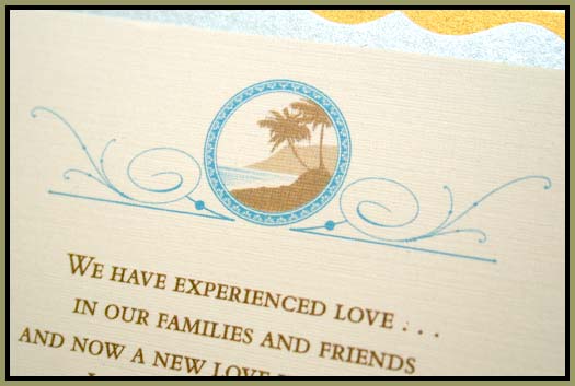
A
closer look at the invitation's decorative beach accent that was designed for the invitation. This flows perfectly with the embellished look of the set and still keeps the beach feel.
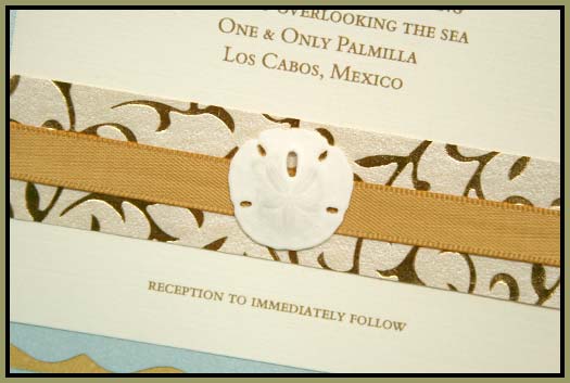
The bottom of the invitation is wrapped with matching gold patterned paper, gold satin ribbon and a small sand dollar.
It matches the packaging perfectly.
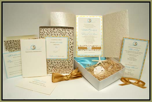
The
entire boxed set consisted of a wrapped Wedding Invitation, one Additional Events invitation,
one Additional Information booklet, one response
card and envelope with postage.
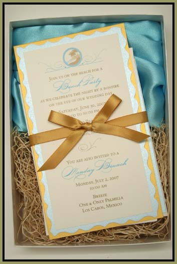
Your guests would find these
additional elements underneath the invitation, out of sight
when the box is first opened and
in the appropriate order of importance. The bundle is tied together with a gold satin bow, easily untied or slid off by the guests.
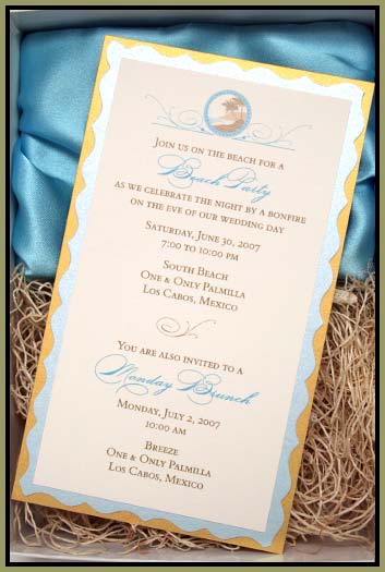
The additional events are presented to the guests with a matching invitation that mimics the larger formal invite. This invitation is 3-layered with ivory linen, aqua shimmer, and gold shimmer.
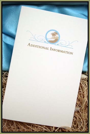
The front of the informational booklet..
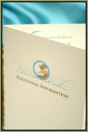
The inside of the booklet would contain the information necessary for the guests.
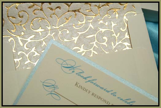
The response envelope is lined with the matching ivory and gold vine pattern.
This is a very unique element for the set and will most definitely impress your guests.
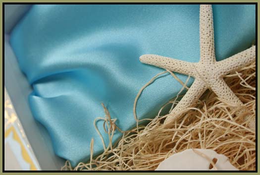
A closer look at the texture of the starfish against the smooth satin.
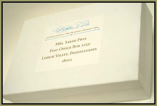
The mailing box's outside label is designed to match the invitation set and introduces the colors and theme to the guests before the box is even opened. The postage used for the outside of the box would match the response envelope inside.
* * * * * OPTION #2 (TEAL & GLASS BEAD) * * * * *